For my design blitz, I decided to take photos of signs or advertisements or announcements-type things around Mary Wash. And once I started looking, I saw how they are everywhere. Some have pretty good designs, some maybe needed one more look over, and some you wonder who gave the okay to put that on a wall.
To see them all in one place,
Instagram Post that Wouldn’t Embed 🙁
Color

This is the first picture I took, funnily enough, because it caught my eye. So this seemed like a good example of color. The color pallet of the place where this sign was had mostly browns and greys, typical muted tones. This bright yellow and red text stood out a lot, and for good reason, that is what it is supposed to do: be eye-catching before someone slips and falls.
Typography

This one is something I didn’t notice for a while, but once I did I think I laughed out loud. It is in the UC, right above the drink section in the back behind the salad bar. If you can’t read the word, I know the photo is a little fuzzy, it says ‘quench’ in black letters. This is the one that I think is a little wonky. I don’t think ‘quench’ is the right word, it seems a little strong and slightly archaic, but the font is the kicker. It’s bolded and black and almost the opposite of the water graphic behind it. A lighter, more fluid font would have matched better.
Minimalism & use of Space

This one I chose for minimalism because there is not much going on besides the words and the little icon of the wi-fi signal, and even the icon is small and not very dense. There is a lot of space here and it works to do the job. It’s simple but effective in announcing that there is something called UMW wireless even if it gives you no further information.
Form/Function/Message
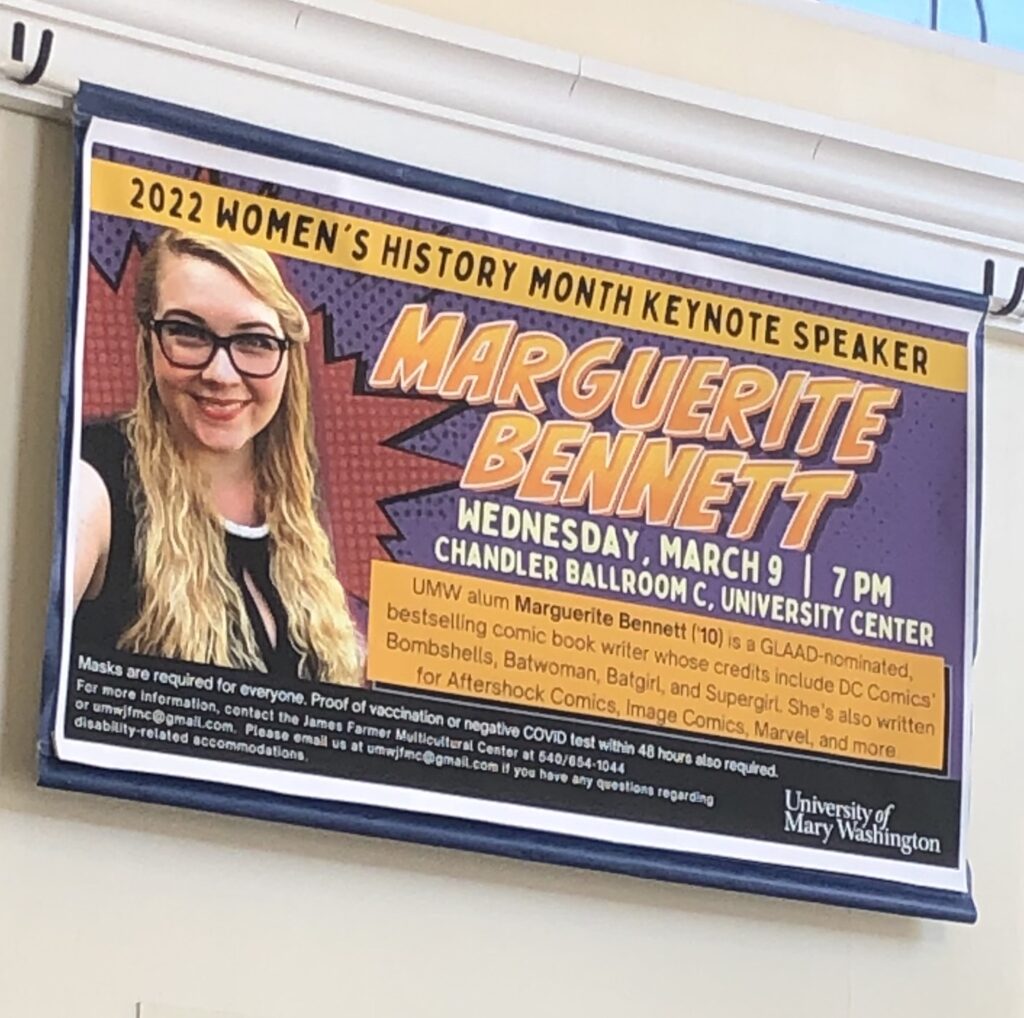
Most of the photos before this had some form or function, but this one was the one I wanted to focus on. The banner is for an event, so it has a lot of information on it, and it is eye-catching because of the bright colors and comic-strip-like design. It gets your attention and then advertises an event.
Balance

I didn’t realize how aesthetically pleasing ketchup packets are until I really looked at them. The shape that their logo/title is in is very cool and all the colors and photos and font match or compliment each other very well. I chose this one for balance because if you drew a straight line down the packet, both sides would be almost mirror images of each other. It only breaks for the tomato image and even that is very symmetrical, with the balance of extra leaves on one side to even out the longer stem on the other. I also for some reason just really like the design on this packet so I wanted to put it in. Also also, red is supposedly a color that puts people in mind of food and eating. Something historical about the cavemen and the blood of fresh meat. Doesn’t really apply as the red color here is just the color of actual ketchup and I am a vegetarian but still.
Don’t mind me if my next google search is Hinez ketchup phone cases.