“As designers are shifting towards the KISS – Keep it simple stupid formula and creating Logos that are super simple and easy to understand. I want a something challenging Logo that is simple yet detailed. I know it is hard to a achieve but not impossible. You can use logo generator tools like https://www.logoorbit.com/ or https://www.tailorbrands.com”
Create A Logo That Is Simple But Detailed
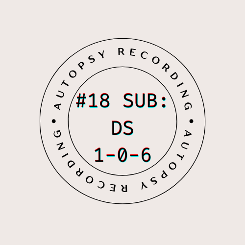
I thought that the biggest problem with this assignment was going to be coming up with the word part of the logo. What title or catchphrase could I use as a logo for a narrative podcast about aliens and space post-mortems? Well, that turned out to be very simple, take that overthinking brain! The title of the specific coroner’s recording had letters and numbers in a subtle nod to this class, so I choose that.
I wanted a design that was like the stamps that go on library books. The ones that have the name of the library on it but also the date.
I went to canva, which is so awesome to do designs on. It has a simple and intuitive interface and it is very easy to pick up and use. I actually found a template that was very close to how I wanted the logo/stamp to look and when I played around a bit, I got this.

I was very picky with the font cause I wanted it to look just like those kinds of stamps. {The circle around it would be the part that stays consistent and the title in the circle would be the part that changes based on the number of the recording.}
Now, I wanted the type to look sort of imperfect, like how an actual stamp looks like when you stamp it, but canva did not have a ‘click here to make the font look like ink on textured paper’ but it did have a filter called ‘glitch’ that added some layers and makes it look suitably fuzzy.
I imagine this logo in black ink stamped on the cover of the manila file folder with the transcript inside of it, filed away but ready to be read by whatever curious intern picks it out.