“Now that we have a #ds106 radio up and running creating a 15 to 30 second bumper for the station. What is a bumper? It is a short recording that identifies the radio station with signature music or an expression that makes sure the listeners know what they are tuned into (see http://en.wikipedia.org/wiki/Bumper_(broadcasting)). So for ds106 it should certainly include “DS106 Radio” and some sort of message about the station with voice over music.”
So for this bumper I had our group project idea in mind. I thought through what circumstances a person would be able to hear this recording, maybe stored by an archival company? I’m not sure of the details, but this bumper is basically a release form for the autopsy recording. I did have a lot of fun with the random code in the beginning and hiding the DS 106 radio mention in it.
For the voice, I wanted a machine. It took some time to find a text to speech that wasn’t rotted as hell, but this one did the trick. I used US English James. (I edited out the part that said it was a demo : )
Although there is no music, I did layer a lot of different types of static/computer noises to get it to sound just right. I wanted it to sound old and very static and also have a lot of interference. ( the beeping is morse code, though I don’t know what it is saying) I love all how all the layers mix, it was definitely worth it. I got all of the sounds on free sound and they actually have a lot of really awesome statics.
I edited it on iMove, of course.
I didn’t know there were this many types of static until this very night.
“Create a 30-45 second radio commercial for a product from the 80’s. Add in some background music and/or sound effects to make it sound like a real radio commercial.”
I know creative people usually hate the question ‘where does your inspiration come from?’ and usually have a slew of witty answers to snap back. But in this case, I can kind of explain where the inspiration for this came from.
Well, first It might come as no surprise to you that I am indeed stressed. I am very busy at the moment and so are a lot of the people around me. At least four people I have talked to today mentioned stress eating, and I will admit that the amount of desserts I had tonight is not a usual number for me. I am not on my fourth cookie right now, no not at all. So a stress-eating product, from there it was just a short jump to gum and an even shorter jump to the product being very ironic and clearly an extremely bad idea.
I don’t know if you have seen unedited footage of a bear, but that is kind of the way I wanted this to go. I wanted this commercial to be not quite right. Between that and too many late nights stuck on infomercial channels, I was good to go.
I wrote the script and recorded it,
then it was time for the music.
Like the assignment description says, go 80’s. With such a specific and wonderful direction, I went for it. I looked for 80’smusic on free sound and found my clip. It was only thirteen seconds. That fact becomes important later.
I wanted the commercial to get progressively weirder and more uncomfortable as it went on, and what better way to do that than through music? (Turns out there is a better way, and I did that too, but for now, let’s talk music) Instead of looping the music cleanly, which I could have done, I made it glitchy and rough. It might not be super noticeable, but the music is definitely not quite right and that’s the feeling I wanted to convey.
Then for my favorite/least favorite part: the chewing. I was thinking about what kind of sound effect I could add in— and this was just too perfect to ignore. I started the sound off slowly and made it get louder and louder until it is impossible to ignore and quite difficult to listen to. I actually haven’t listened to the finished product more than I had to because the chewing sounds are very very gross.
Oh, and if you are new here to a bird’s string of thought, I edit audio on iMove, and it looks like the photo above.
Oh how the gentle wind, beckons through the trees…
@ds106dc#tdc3694 My response for Today's #ds106 Daily Create is Two. I saw the shelf of bottles move and the yoga ball disappear, I suppose I see but do not observe
“As designers are shifting towards the KISS – Keep it simple stupid formula and creating Logos that are super simple and easy to understand. I want a something challenging Logo that is simple yet detailed. I know it is hard to a achieve but not impossible. You can use logo generator tools like https://www.logoorbit.com/ or https://www.tailorbrands.com”
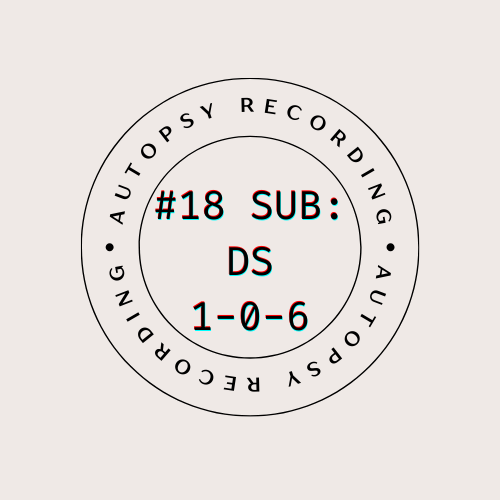
I thought that the biggest problem with this assignment was going to be coming up with the word part of the logo. What title or catchphrase could I use as a logo for a narrative podcast about aliens and space post-mortems? Well, that turned out to be very simple, take that overthinking brain! The title of the specific coroner’s recording had letters and numbers in a subtle nod to this class, so I choose that.
I wanted a design that was like the stamps that go on library books. The ones that have the name of the library on it but also the date.
I went to canva, which is so awesome to do designs on. It has a simple and intuitive interface and it is very easy to pick up and use. I actually found a template that was very close to how I wanted the logo/stamp to look and when I played around a bit, I got this.
I was very picky with the font cause I wanted it to look just like those kinds of stamps. {The circle around it would be the part that stays consistent and the title in the circle would be the part that changes based on the number of the recording.}
Now, I wanted the type to look sort of imperfect, like how an actual stamp looks like when you stamp it, but canva did not have a ‘click here to make the font look like ink on textured paper’ but it did have a filter called ‘glitch’ that added some layers and makes it look suitably fuzzy.
I imagine this logo in black ink stamped on the cover of the manila file folder with the transcript inside of it, filed away but ready to be read by whatever curious intern picks it out.
We started brainstorming last night and after an hour of bouncing off of each other and worldbuilding, we had an outline on the google doc. The basic idea was mine originally, but that seems so strange to say now because by the time we had finished talking, the nighttime hours having significantly progressed, everyone had contributed so much that trying to trace the ideas, or even singular plot points, back to one person was impossible. It really was a completely equal collaboration.
I won’t betray too much of what happened, gotta keep those details secret until you listen to the radio show, but everyone was thinking of new ideas or expanding on things someone else mentioned. We discussed how the plot was going to progress, some backstory, what audio elements we wanted to include, some different audio effects we could use to make layers, characters, and potential voices for them, etc. We also discussed logistical things like who had access to a microphone and whose strength fit what aspects of the project.
I volunteered to write the script. I am a creative writing major, so that is right up my alley. I started writing as soon as I could pull up a format for scripts and I put the finishing touches on the first draft just this afternoon. It stretches the better part of ten pages and also includes ideas for potential audio effects designated with the symbols <>. Ex. <cracking of bones and stretching of flesh> I am honestly so proud of the work that we all did. Despite being done completely over discord chat and a google doc, this was easily the best group project dynamic I have ever had so far. And I am so stoked to see how the finished project turns out!
It has only been a week since our last correspondence, but it has felt like much longer. Between my scholarly pursuits, regular riding practice, my father’s lengthened business trip in Broque, helping my sister with the family trade, and my many other necessary engagements, I have hardly had time to sit still. But I have carved out a moment to share with you the developments I have thus found in our pursuit of the mystical.
I was able to translate some of the spells and recreated them to the best of my ability. The instructions were detailed, and I had to research another dialect of the language to read parts of them.
I have added a brief summary of my newfound knowledge of the sub-dialect ‘Digital‘ for you to pursue. Mayhaps it helps you in the translations of your own volume.
The first spell was a liquid concoction to engage visual understanding. I hesitate to call it a potion, but I know that is doubtless what you would think to call it.
The second spell was designated to be a spell of the mind. It boasted powers to defeat what those new-fangled authors call “writer’s block” by opening the creative centers of the brain. I have not the bravery to test them out yet, but they say there is a time for everything.
Now, this next mystical set took most of my unaccounted time this week to translate and piece together. What is becoming a common theme in this volume that I have, is the optical senses. I have included the pages regarding melodies in relation to eyes, a nonsensical message, fine art, and the possible existence of inhuman species. I do hope you will read through these and enter into a deeper correspondence with me regarding them. Seeing as you and I are the only ones with volumes of The Studies of a Digital Kind, I think we ought to give this mystic our best attention.
I have added here as well a list of further passages I have not been able to translate. I hope that maybe one of the libraries near you has a guidebook to this language. I hypothesis that it is a northern dialect of the aforementioned ‘Digital’ language, which would put you in a much better position to research it than me.
I believe the postal carriage between here and your residence is beginning to run twice each fortnight, please make use of it. Inform me of anything you can discover about what I have thus sent you or anything that you have gathered from your own volume.
@ds106dc#tdc3687 My response for Today's #ds106 Daily Create. Person 1: Today is going to be biscuit brilliant! Person 2: If you say biscuit brilliant again I am going to rivet your eyeball. pic.twitter.com/uf0a9ruZt7
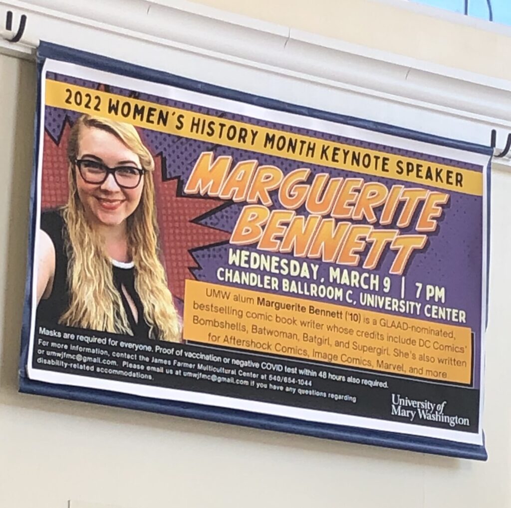
For my design blitz, I decided to take photos of signs or advertisements or announcements-type things around Mary Wash. And once I started looking, I saw how they are everywhere. Some have pretty good designs, some maybe needed one more look over, and some you wonder who gave the okay to put that on a wall.
This is the first picture I took, funnily enough, because it caught my eye. So this seemed like a good example of color. The color pallet of the place where this sign was had mostly browns and greys, typical muted tones. This bright yellow and red text stood out a lot, and for good reason, that is what it is supposed to do: be eye-catching before someone slips and falls.
Typography
This one is something I didn’t notice for a while, but once I did I think I laughed out loud. It is in the UC, right above the drink section in the back behind the salad bar. If you can’t read the word, I know the photo is a little fuzzy, it says ‘quench’ in black letters. This is the one that I think is a little wonky. I don’t think ‘quench’ is the right word, it seems a little strong and slightly archaic, but the font is the kicker. It’s bolded and black and almost the opposite of the water graphic behind it. A lighter, more fluid font would have matched better.
Minimalism & use of Space
This one I chose for minimalism because there is not much going on besides the words and the little icon of the wi-fi signal, and even the icon is small and not very dense. There is a lot of space here and it works to do the job. It’s simple but effective in announcing that there is something called UMW wireless even if it gives you no further information.
Form/Function/Message
Most of the photos before this had some form or function, but this one was the one I wanted to focus on. The banner is for an event, so it has a lot of information on it, and it is eye-catching because of the bright colors and comic-strip-like design. It gets your attention and then advertises an event.
Balance
I didn’t realize how aesthetically pleasing ketchup packets are until I really looked at them. The shape that their logo/title is in is very cool and all the colors and photos and font match or compliment each other very well. I chose this one for balance because if you drew a straight line down the packet, both sides would be almost mirror images of each other. It only breaks for the tomato image and even that is very symmetrical, with the balance of extra leaves on one side to even out the longer stem on the other. I also for some reason just really like the design on this packet so I wanted to put it in. Also also, red is supposedly a color that puts people in mind of food and eating. Something historical about the cavemen and the blood of fresh meat. Doesn’t really apply as the red color here is just the color of actual ketchup and I am a vegetarian but still.
Don’t mind me if my next google search is Hinez ketchup phone cases.
The Demon Seated, Lermontov's Demon as interpreted by Mikhail Vrubel, 1890 | DecalGirl (I might have adjusted some of the color levels) https://t.co/Jh4vMjOF17
“I know some of us (myself included) are a bit particular about the looks/cleanliness of our technology. But if that didn’t matter, and you had all of the resources at your fingertips, without any fear of it hurting your technology, what would you make as your laptop cover? Make your own collage or create your unique laptop skin on My Custom Skin, and then share your work flickr. When you blog about it, explain why you chose each image! Use it as a way to share a little about yourself with your classmates.”
Computer cases or stickers/decals are a great way to add some fun to everyday tech, and to show a little bit of yourself on your machine. If I had some extra money, and a laptop that wasn’t already decked out in decorations, this is what I would get.
Ever since I stumbled across the painting The Demon Seated, by Mikhail Vrubel, I have had it stuck in my head. It is my computer home screen and I am currently trying to get my hands on a paper copy of the poem that he based it off of. Not the original version, which is in Russian, but a nice English translation.
Anyway, I took the image and ran it through some filters on preview, basically, I played around with the colors until I liked how it looked. The original version was just a little too light for my taste, I wanted it with more contrast, more drama, and substance. Then I uploaded it to Decal Girl to make my sticker.
I’m just going to put it here again because I just like it so much.
Art actually evoking feelings in the viewer? Ha, couldn’t be me.